

Make the first screen understandable
A mobile visitor should quickly recognize the brand, understand the page, and see a clear next step. Filling the first screen with a large logo, repeated business names, multiple slogans, and several oversized buttons makes this harder. For an adult business website, clear information and a controlled visual style are more useful than adding effects everywhere. Start with one main message and one primary action, then move supporting detail into the sections below.
Keep the header to one organized row
Use the brand on the left and the menu control on the right. If the logo already contains the business name, do not repeat that name beside it on either mobile or desktop. A standalone symbol can use a short adjacent name. Long aliases and promotional subtitles belong in page content rather than being squeezed into the navigation bar. Reserve enough width for the menu control and check that a long business name cannot push it off screen.
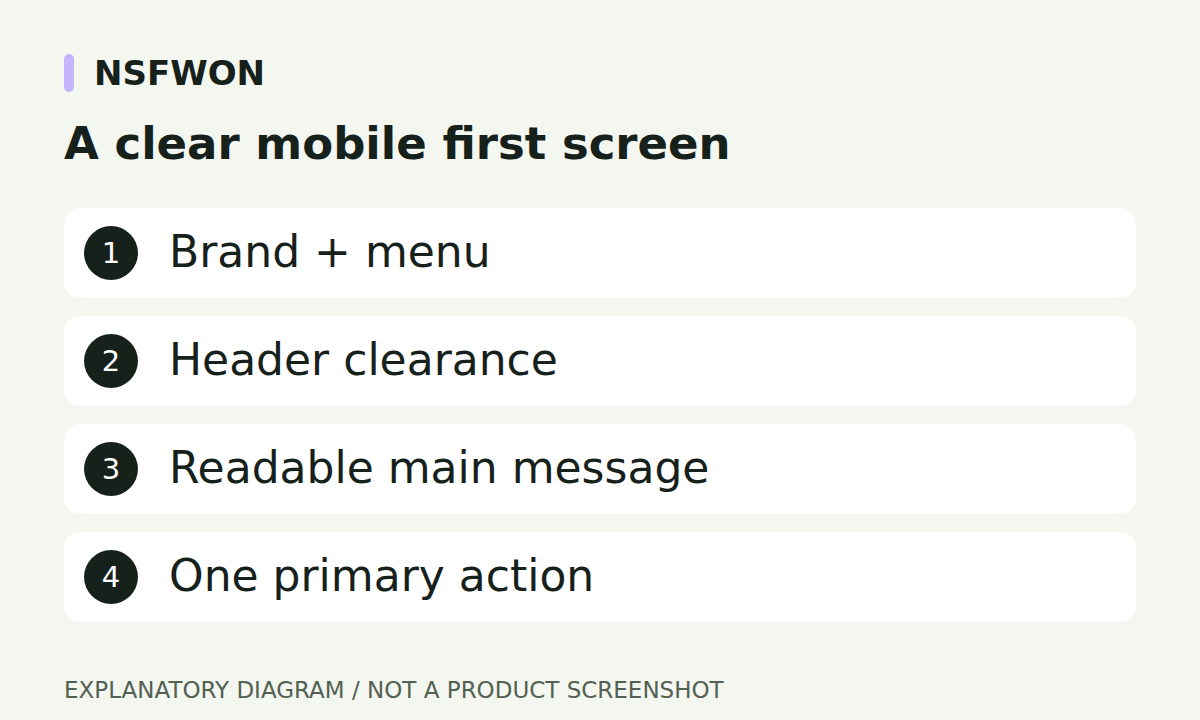
Illustration: A clear mobile first screen. This diagram explains the workflow; it is not a product screenshot.
Keep fixed headers away from hero copy
A fixed header sits over the page instead of occupying normal document space. The first hero text therefore needs separate clearance. NSFWON’s shared layout accounts for fixed header coverage; section spacing should not undo that clearance. Sticky or ordinary headers should not receive the same extra offset twice. In preview, inspect the very first line of text, not only the main headline. Test again after opening the menu, changing the viewport, and loading a different logo.
Use restrained type and consistent spacing
Begin with a mobile H1 around 28–34 pixels, body text around 15–17 pixels, and comfortable line spacing, then judge the result with the actual wording. These are design starting points, not search-ranking requirements. Shorten a heading when it becomes difficult to scan instead of forcing it into a narrow box. Keep a consistent left and right alignment through the header, body, and footer. For Korean content, review natural line breaks and long service names on a real narrow viewport.
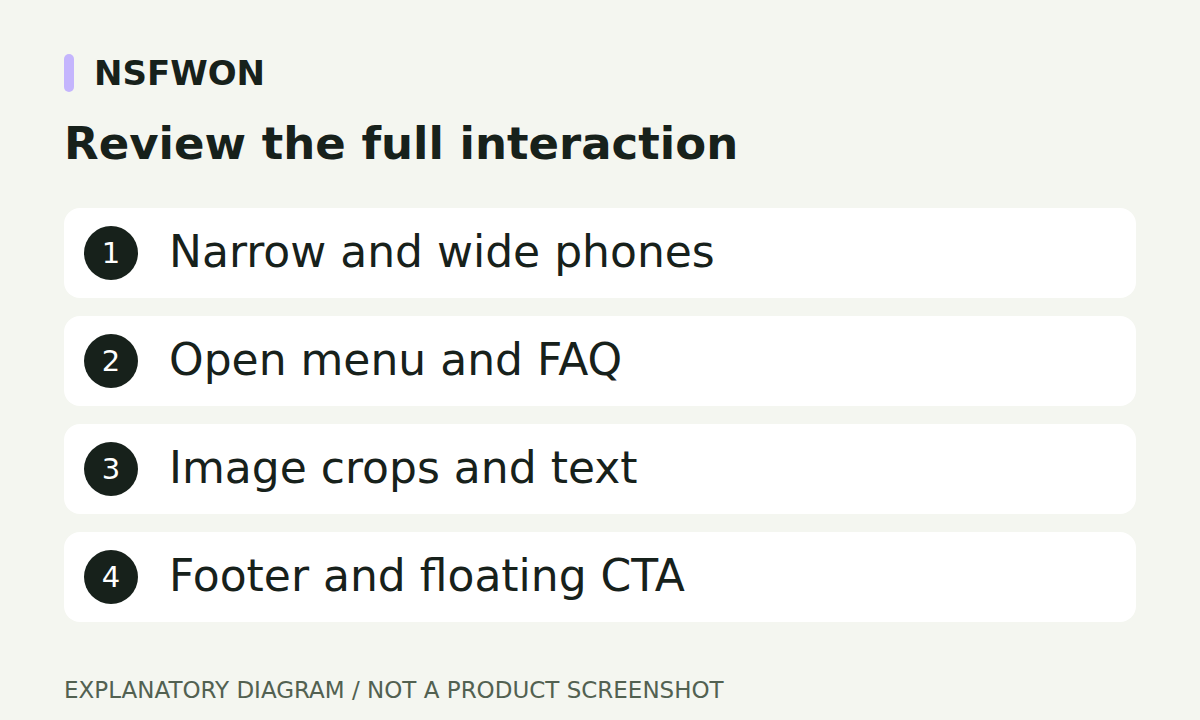
Illustration: Review the full interaction. This diagram explains the workflow; it is not a product screenshot.
Give images and actions enough room
Use a consistent gallery ratio so the page does not jump between unrelated image heights. Four images can work as a two-column mobile gallery when their subjects remain clear. Avoid placing text controls over important details in the photographs. Contact buttons should have concise labels, visible spacing, and comfortable touch areas. A persistent bottom action must not cover the last paragraph or footer link. Keep the full phone number readable without forcing a long sentence into one small button.
Test more than one phone width
Review at least 360, 390, and 430 pixel widths as well as desktop. Open and close the menu, expand FAQ answers, follow contact links, and scroll all the way to the footer. Check for overlap even if there is no horizontal scrollbar: two elements can collide inside an otherwise correctly sized page. Repeat the review after copy, logo, and image changes. A reusable mobile checklist is more reliable than assuming the layout remains correct because the original draft looked good.
Continue with NSFWON
Open NSFWON, review the current plans, or contact support. Read the related guide: Enquiry and Booking Buttons for Adult Business Websites.